Notre Dame-Cathedral Latin sophomore Sean Morad has an unusual claim to fame — his design was chosen for new welcome signs across Chardon Township.
Notre Dame-Cathedral Latin sophomore Sean Morad has an unusual claim to fame — his design was chosen for new welcome signs across Chardon Township.
“The background behind this project is that the township currently has the generic highway sign to let constituents know when they’ve entered the township,” Trustee Jacob Cimperman said. “I wanted to look into creating a welcome sign with a more appealing aesthetic to promote the beauty of Chardon Township.”
An NDCL alumni himself, Cimperman was excited to partner with the school.
Digital design students submitted over 60 signs, he said.
Sean recalled being approached and asked if he would like to participate in the project after helping graphic design and art teacher Ryan Brlecic after school.
“Without even thinking about it, I made sure I had all the information about the project and began working at home,” he said. “Design projects are something I like to do in my off time or between work. I can still remember making the first few concepts on my kitchen counter on my laptop. I didn’t know then just how far it would bring me.”
Brlecic reflected on the opportunity the project provided his students.
“Leveraging an exciting opportunity the Chardon Township Trustees provided, I introduced my students to a project that mirrored a professional design process,” he said. “They engaged in client intake, developed a design brief, formulated questions, brainstormed solutions and presented their concepts. Their performance exceeded my expectations and goals.”
Sean exemplifies the talent emerging from the design program, Brlecic said.

“As a freshman in my design class last year and now as a sophomore, Sean has consistently impressed me with his creativity and dedication. His involvement in Studio 222 — a student-led initiative producing NDCL banners and signs for events — further highlights his knack for design,” he said.
When talking about his creative process for the sign, Sean said he incorporated Chardon’s colors and symbols with a modern theme.
“I first started by researching Chardon and its uniqueness, things like the deer and the date. Then, I put together about three designs, and after asking my family, peers and Mr. B., I locked on to a final design,” he said. “This didn’t come simply. I feel as if all good designs come together gradually. They don’t become clear until you make progress.”
He didn’t know how to feel at first when his design was selected, he said.
“Many people have used my designs for logos, business cards, shirts and posters,” Sean said. “Then it hit me — so many people would see the sign and I was happy that I was chosen and recognized for the work I did.”
While Sean’s original design featured a red background, concerns were raised about having red signs that aren’t stop signs on the roadways, Cimperman said.
The revision process is like a tune-up, Sean said.
“This process can be so important because things like this can’t be reprinted, which makes me even more excited,” he added.
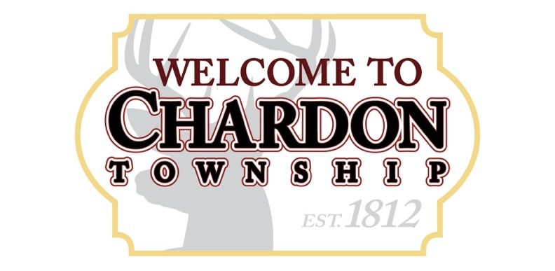
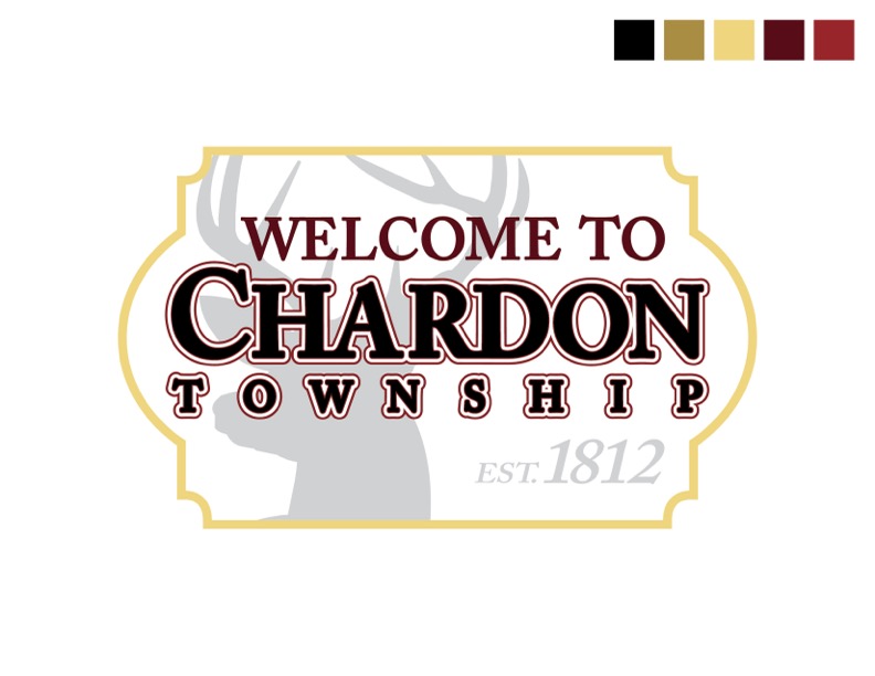
The finished design features the gray silhouette of a deer’s head against a white backdrop and is framed in a gold border.
While Chardon’s classic red and black are still featured, it is as text rather than background color.
Cimperman is currently seeking quotes for the signs. The township hopes to complete the project over the next two years, he said, with roughly 15 signs purchased each year.
Main roads and roads with heavier traffic will be prioritized in the first year.


